Banners have become a staple for businesses, events, and public campaigns. Regardless of whether it’s being used outside a store or at an event, a well-designed Panaflex banner can grab attention, turn visitors into customers and stay in people’s minds. But you need your design to be exactly right to accomplish this.
Here, you’ll find many valuable tips to help you make your Panaflex banners look impressive.
What Is Panaflex Printing?
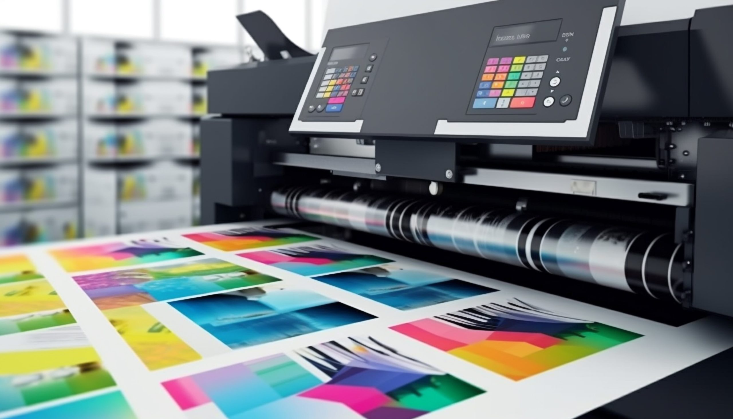
Panaflex printing refers to the process of printing high-quality graphics on a flexible plastic material often used for outdoor signage. Its durability and eye-catching colors mean Panaflex is great for use on shop signs, billboards and banners at events. This means that, unlike other posters and banners, Panaflex is suitable for areas that experience bad weather conditions.
Why Banner Design Matters
Remember the last time you strolled on a street full of people. With everything buzzing and crammed together, what did you choose to notice? More than likely, what caught your attention was a banner that was attractive, contrasted the background well, got the message clear, and stood out vividly from the rest of the ad. It certainly wasn’t by luck.
An effective banner helps promote a company silently, highlighting important points and making people recall the brand.
1. Start with a Clear Purpose
Every banner should have one clear goal. Are you announcing a grand opening? Promoting a limited-time offer? Directing people to a new location? Define this objective early in the process; it will guide every design choice, from layout to font selection.
2. Know Your Audience
A banner for a corporate seminar will look vastly different from one advertising a music festival. Ask yourself:
- Who will see this banner?
- What tone should the design convey: professional, fun, urgent?
- What information matters most to this audience?
Knowing your audience allows you to tailor your visuals and messaging for maximum impact.
3. Promote Simplicity
When it comes to banners, less truly is more. Panaflex banners are often viewed from a distance or in passing. That means you have just seconds to get your message across. Keep text minimal, avoid clutter, and focus on the essentials.
Pro Tip: Use the 5-second rule; if someone can’t understand your banner’s main message in five seconds or less, simplify it.
4. Bold and Readable Fonts
Choose fonts that are clean, bold, and legible from a distance. Sans-serif fonts tend to work well for large formats. Also, make sure to size your text appropriately:
- Headline: Largest and most visible (e.g., 100+ pt)
- Subheadings: Medium size to support the headline
- Body text (if needed): Clear but minimal
Stick to a maximum of two fonts to keep your design cohesive and professional.
5. Strategic Use of Color
Color is a powerful design tool. It can evoke emotion, drive attention, and increase readability. Use high-contrast color combinations (like white on dark blue or black on yellow) to make your text stand out.
Keep brand colors in mind, but don’t be afraid to experiment with bold shades that demand attention, especially for call-to-action phrases.
6. Use High-Quality Images and Graphics
Blurry or pixelated images can ruin an otherwise great design. Always use high-resolution graphics suitable for large-format printing. When possible, choose visuals that evoke emotion or tell a story. And make sure your images align with the message, don’t use stock photos just for the sake of filling space.
7. Create a Focal Point
Your banner should have one main element that draws the eye. This could be your headline, a product photo, or a powerful call to action. Use size, placement, or color contrast to emphasize it.
Don’t let secondary information distract from this focal point. Instead, organize other elements around it.
8. Incorporate Branding Elements
Your banner should feel like a natural extension of your brand. Include your logo, use brand colors and fonts, and stick to your visual identity guidelines. Consistent branding not only builds recognition, but it also builds trust.
9. Include a Strong Call to Action
Irrespective of whether it’s “Visit Us Today,” “Call Now,” or “Scan the QR Code,” a clear and compelling call to action (CTA) can drive real results. Make it prominent and action-oriented. In the case of Panaflex banners, which are often printed for marketing campaigns, don’t let viewers walk away without knowing what to do next.
10. Choose the Right Size and Placement
The size of your banner should match its purpose and viewing distance. A street-side billboard needs large text and visuals, while a storefront banner might allow for finer details.
Likewise, placement affects design choices. Will the banner be hung high? Placed behind glass? Lit at night? These factors influence color choice, font size, and more.
11. Test and Get Feedback
Before you send your final design to print, ask for feedback from others. Sometimes, a fresh set of eyes can catch things you missed, like hard-to-read text, awkward spacing, or an unclear CTA. Even a quick mockup printed at scale can help you spot issues that aren’t visible on a computer screen.
Let the Pros Help
Designing for print, especially large-format Panaflex banners, comes with unique challenges, like accounting for print bleed, color accuracy, and resolution. If you’re unsure where to start or want to ensure professional-quality results, consider working with experts like Royal Graphics. With years of experience in custom Panaflex printing, they bring a level of polish and precision that turns ideas into attention-grabbing reality.